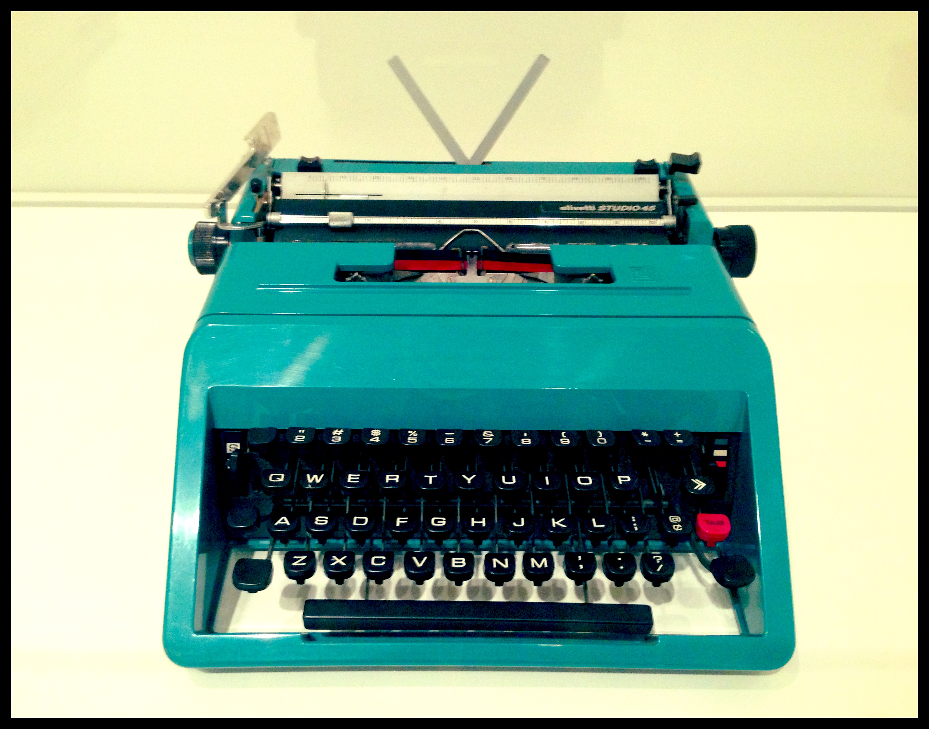
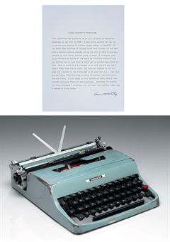
The other day, while mapping out an upcoming museum visit for the class I am teaching this summer, I found myself wandering through the design and architecture galleries at the Art Institute of Chicago. I have been thinking a lot lately about the often tenuous line that separates a designed object and a sculptural thing. The current exhibition, Sharing Space: Creative Intersections in Architecture and Design, culled from the AIC’s permanent collection, seemed like a particularly apt opportunity to further consider this liminal space, since the exhibition takes as its focus the point where two disciplines, in this case architecture and design, meet. Among the numerous schematic drawings of three-dimensional things, sculptural models, and hybrid objects was an bright teal Olivetti Studio 45 typewriter designed by Italian postwar artistic polymath Ettore Sottsass. Admittedly the color is what initially grabbed my attention, but the more I stood and looked at this object the more I was struck by its overall aesthetics: the considered selection of the font on the keys perfectly complementing the simple, clean lines of its frame; the single red key balanced by the red stripe on the ribbon; the small details, like the teal ends of the knobs, aspects that go beyond mere functionality. Sitting in its well-lit vitrine, its elements casting dramatic shadows, this object, this thing made to type words on paper, possessed some serious presence.
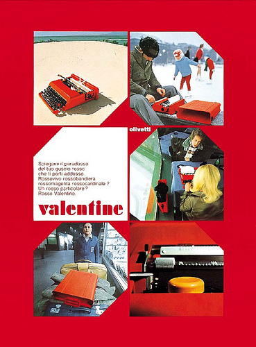
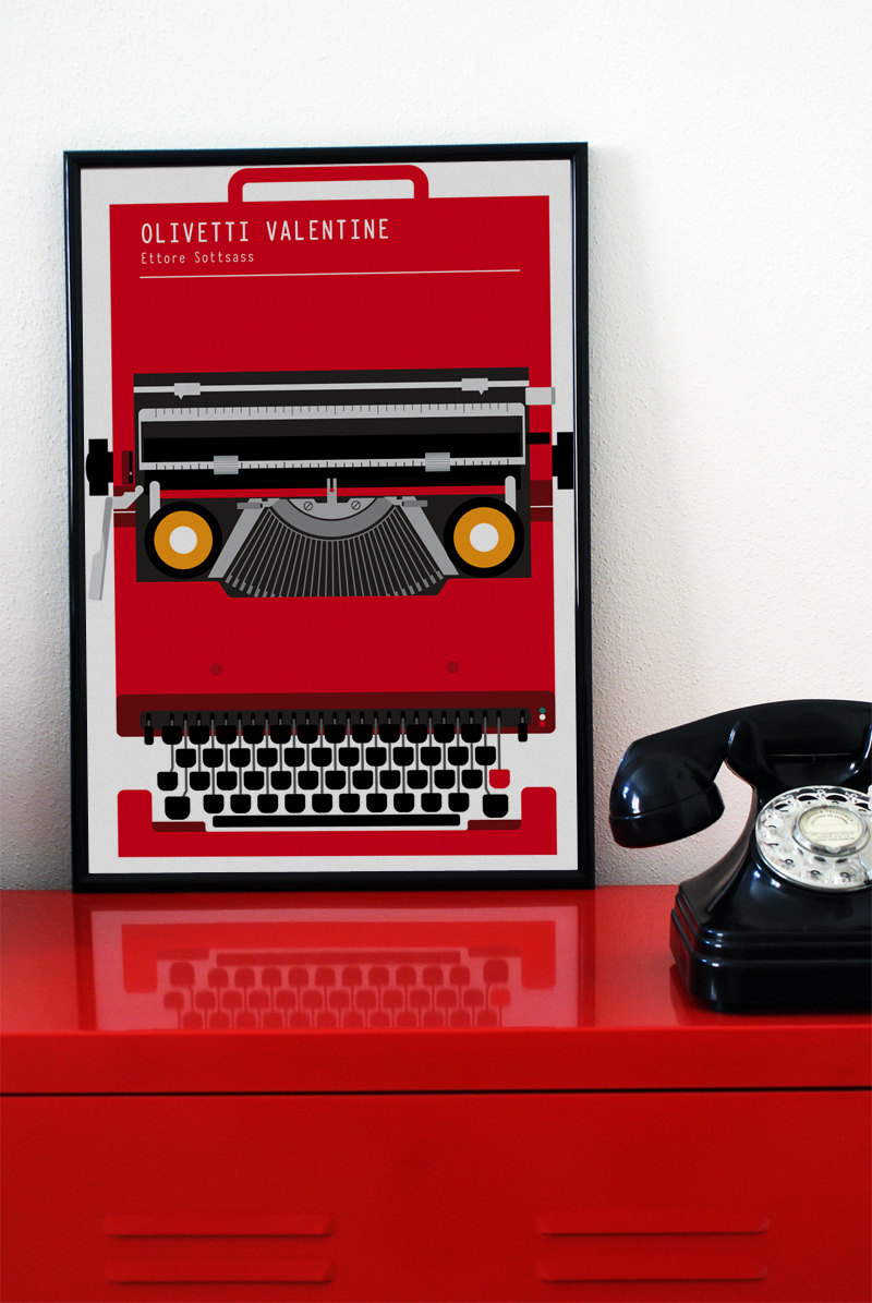
The Studio 45 was just one of many typewriters Sottsass designed for Olivetti over his near three decades long professional relationship with the Italian company. Influenced in part by the American Pop artists, many of Sottsass’s designs for Olivetti shared bold, candy coloring, an aspect that has led many design historians to equate his typewriters with Apple’s iPods and iMac desktops of the late 1990s, notable for their translucent brightly hued shells. Such comparisons are especially apt in regards to Sottsass’s 1969 Valentine typewriter. Collaborating with the English designer Perry A. King, Sottsass designed the Valentine in a handful of bright colors, but the model is most associated with its cherry red version. The typewriter came with its own carrying case and was meant to to be used, as Sottsass said, “anywhere but in an office, so as not to remind anyone of monotonous working hours, but rather to keep amateur poets company on quiet Sundays in the country or to provide a highly colored object on a table in a studio apartment.” Sottsass stated:
“We designed the Valentine in the belief that a biro, a hat, a jacket or a portable can also belong to a different type of rhythm, to a catalogue of values and to the measurement of space or environments which are not inevitably those of property, continuity, definition and all those things, but also be the environments, spaces, rhythms, dimensions and value of a continuous creativity, of the permanent discarding and recreation of language…(Quoted in Hans Higer, Sottsass jun.: Designer, Architect, Artist [Tübingen: Wasmuth,1993], 39). ”
The Valentine, like the products Apple would go on to produce decades later, were tailor made to and even helped shape a certain type of modern lifestyle. Olivetti typewriters became stylish, international symbols of the new postwar world, often marketed via equally stylish advertising campaigns. Interestingly, the Valentine, which entered into the collection of the Museum of Modern Art in New York a mere two years after it first went into production and has since gone on to become something of a fetishized, cult design item, was neither overly profitable during its production run, nor one of its more technically innovative models.
The lasting legacy of Sottsass’s designs for Olivetti, however, is not surprising. Good design, whether functional or not, has the power to transform a mundane, utilitarian thing into a striking, autonomous fine art object, effortlessly dissolving into the territory of a sculptural thing (and yes, I am aware that proclaiming such a statement might make me unpopular with certain design practitioners and historians). The continued appeal of Sottsass’s Olivetti designs though also has a lot to do with the material fact that they are typewriters.
I often and embarrassingly find myself, usually during periods of intense writer’s block, gazing down at the Macbook Air I am typing this post on, and thinking to myself, “Jesus, this thing is beautiful.” While admiring its minimalist design and happily feeling its amazing portability as I place it in a bag to take to let’s say the park or the ice skating rink pictured in the above Valentine advertisement, I am equally aware that within a few years time there will be a new Apple writing device to covet. Sottsass’s Olivetti typewriters continue to enchant and circulate in our current digital age not just because they are colorful or now possess a cool, vintage aesthetic, but because they suggest a kind of permanence we rarely get from the things populating our workspaces today. There are countless youtube videos and internet pages devoted to using, maintaining, and repairing old typewriters; these things that are now essentially relics of the future past. Typerwriters both reside as dead, iconic objects in numerous museum collections and inspire numerous Etsy-Pininterest-Hipster decorative schemes, while also refusing to relinquish their intended functionality. They continue to find a place in this world not as something to decorate the wall or bookshelf in a fashionable loft in Brooklyn but as something with which to, well, type.
Amateur and professional authors alike continue, perhaps with just a little bit of nostalgia, to herald the benefits of these outdated pieces of technology. One of the most famous typewriter-enthusiasts, the noted American writer Cormac McCarthy auctioned off his Olivetti Lettera 32 for charity in 2009. Everything he wrote between 1953 and 2009 was written on that machine, which perhaps, more than its status as a design icon, accounts for its fetching $254,5000; over $230,000 more than its high estimate.
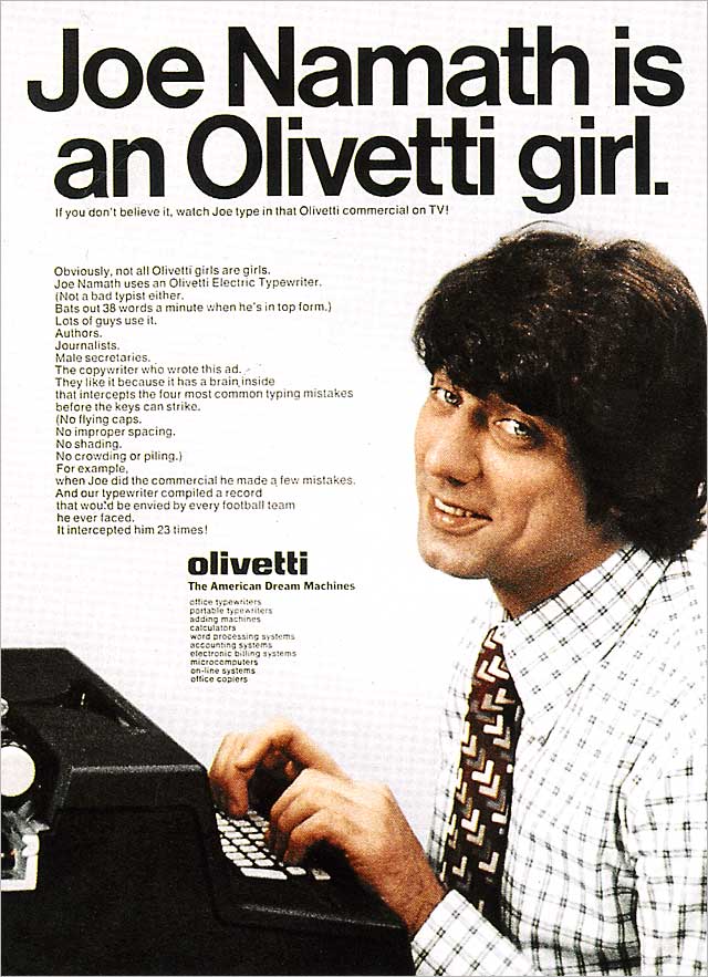
Instead of a proper conclusion to this post, I thought I would leave you instead with the 1972 Olivetti advertising campaign, art directed by the original Don Draper, George Lois, which featured the American footballer Joe Namath. Mostly this is because I find it fabulous, hilarious, and historically fascinating (a little typing time capsule if you will), but it also rather perfectly expresses the significance and the multiple layers embedded in seemingly straightforward objects like typewriters. The campaign was conceived as a response to perceived gender stereotyping in previous ad campaigns depicting “Olivetti Girls,” and so, I leave you with Lois, who recalled (and prepare yourself because this statement is a GEM):
“The Olivetti campaign burst on the scene in 1972, just as the National Organization for Women was flexing its muscles. NOW attacked the campaign for stereotyping women as underlings (they were furious that only men were shown as bosses while only women were shown as secretaries), and they called me a male chauvinist pig. They picketed the Olivetti building on Park Avenue and sent hecklers up to my office to un-n-n-nerve me. Something had to be done. Who can fight a woman’s fury? I capitulated. I would do an ad and a TV spot, with a woman executive giving orders to a male secretary. I cast an actual woman exec (not an actress) as the boss. I cast Jets great Joe Namath as the secretary (because he could type). I invited the women of NOW to view the spot, but when they saw the boss ask her secretary for a date at the conclusion of the spot, they were aghast. (You do very good work, Joseph. By the way, what are you doing for dinner tonight?) ‘It’s an old story,’ I said. ‘The boss always tries to make the secretary.’ They cursed me (I swear), walked out and never bothered this male chauvinist pig again.” [courtesy of Lois’s webpage, www.georgelois.com]

Leave a Reply